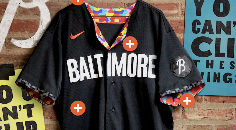

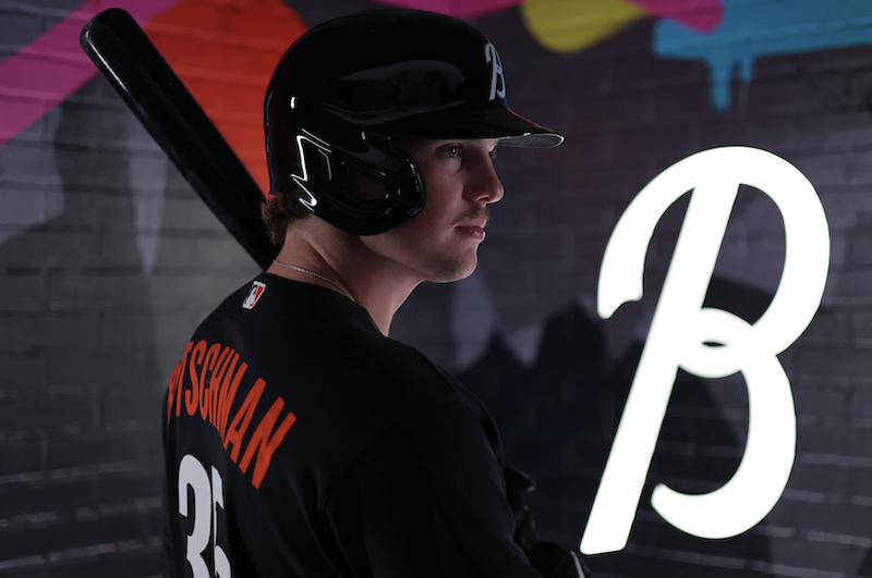
We wanted crabs or Maryland flags, or “Charm City,” or Old Bay Cans.
We got “You Can’t Clip These Wings,” boring white BALTIMORE typeface on a boring black uniform, and some color that’s on the inside and tough to see.
Quite a miss, seems to be the consensus. A letdown after years of anticipation. The Dylan Bundy of uniforms?
Listen, I wasn’t personally mad they didn’t go with any of the above cliche’ Baltimore things. I would have preferred Monument City to Charm City, for instance. Perhaps something giving a nod to Fort McHenry, Francis Scott Key, and the Star Spangled Banner would have been a nice touch. This is just bland though. The neighborhood puzzle and color had potential. Some high socks with it could pop. I like it, where it’s visible. But it seems wasted on the inside. While I disagree with those saying they look as bad as Great Britain’s World Baseball Classic uniforms, I can see where they are coming from.
We are Baltimore. You can’t clip these wings. pic.twitter.com/4eQAdPtmjy
— Baltimore Orioles (@Orioles) May 22, 2023
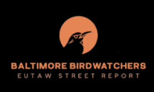
O's City Connect be like pic.twitter.com/WoUI7O33zt
— Eutaw Street Report (@EutawStReport) May 22, 2023
The hat is cool, at least. But I wish the B was orange instead of white. The good news: we all just saved a bunch of money from being eager to rush out and buy these.
The Orioles will wear the City Connect uniforms Friday and Saturday May 26 and 27, then all but two of their remaining home Friday games.
We have a great baseball team. No time to get upset about uniforms. Maybe they’ll grow on us when we see them in action.
THERE IS NO ONE STORYLINE THAT DEFINES BALTIMORE. WE ARE A 3,000,000-STRONG METROPOLIS THAT WILL NEVER STOP BEING A SMALL TOWN OF NEIGHBORHOODS AND INDIVIDUALS WHO TRULY REFLECT US. THIS ORIOLES UNIFORM ATTESTS TO THE POWER OF OUR DIVERSE NARRATIVES, ASPIRING INDIVIDUALISM, AND OUR COLLECTIVE JOURNEY.
Baltimoreans draw strength from the many stories, moments, victories, and tragedies that have defined our 294-year multi-layered history. A proud, gritty, outspoken community – from Sparrows Point to Park Heights to Hopkins Plaza, the Dundalk Marine Terminal to Mount Vernon, Timonium to Tide Point, and Little Italy to Liberty Heights – that reflects the creativity and resourcefulness of the next generation of Baltimoreans, one whose parents and grandparents poured the steel, repaired the ships, founded the finest universities and greatest hospitals, welcomed the world’s immigrants, and integrated the lunch counters. And so, this O’s uniform celebrates the vision this hometown and hometown team share of a colorful and color blind, vibrant, and open community that celebrates our differences and defends equal access to our fundamental American freedoms. There is no “quit” in this place, and when adversity comes, we just start another rally.