While the Orioles were busy spending last week losing every single game – they haven’t won since last Sunday and are currently looking to end a five-game losing skid – at least O’s fans were making sure the team at least won SOMETHING.
Last week, we told you about ESPN’s “Battle of the Unis” tournament to determine the team with MLB’s best looking uniforms.
Despite being a ridiculously low-seeded 13th out of 15 AL teams, the Cinderella Cartoon Bird ran roughshod through the competition, besting, in order, the #4 seed Houston Astros (79% of the vote to 21%), the #5 seed Royals (62-38), #1 seed Tigers (53-47), and #2 seed Yankees (59-41).
The O’s then went up against the St. Louis Cardinals in the “UniBattle World Series,” and defeated the NL representative (also a #1 seed), 59% to 41%. Nearly 150,000 people voted in the final round.
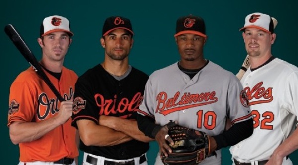
However, Jim Caple – who ranked the O’s so low to begin with – can’t stop being 100% wrong about the white-panel home caps.
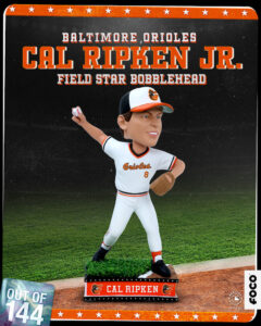
On the other hand … can we talk about those home caps with the white-panel front?
This is a design style from the fashion-challenged late ’70s and early ’80s, and it still looks just as bad as it did then. Manager Buck Showalter famously griped about Ken Griffey Jr. wearing his cap backward in the ’90s (those darn kids today!), but he could improve his team’s look by loosening up and ordering all his players to wear their cap backward.
Apparently, though, our voters either like that cap style or love the rest of the uniform so much that they overlooked it. Despite being seeded 13th because of those caps, the Orioles beat higher-ranked uniforms in every round on their way to the championship.
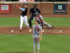
The home uniform, especially with the alternate orange jerseys, is gorgeous, and the white-panel cap only adds to it.
So, at least we’ve got that going for us, O’s fans. The most beautiful uniforms in MLB.
Now, let’s put an end to this losing streak tonight, huh?


