We all love The Cartoon Bird.
Not only does it look infinitely better than the ornithologically correct version, but it goes hand-in-hand with winning (as last year’s success only reinforced), as detailed here.
The O’s had now put forth 20 winning seasons to just four losing seasons while wearing The Cartoon Bird, compared to 12 winning seasons and 23 losing seasons with the “lifelike” bird.
However, The Cartoon Bird itself has undergone quite an evolution during its time, with the current version being number 10.
I see nothing wrong with the current version, myself. I’d prefer The Bird to be wearing a Bird hat of his own, as opposed to an “O’s” one (more of an infinite regression design, like this), but that just feels like I’m nitpicking.
So when I stumbled across the following blog post, claiming to offer “improvements” on the design, I very admittedly had a closed mind.
However, Von Glitschka isn’t just some schlub with a blog, but a pretty well-respected graphic designer, from what I can gather.
As of this writing, Von boasts over 13K Twitter followers, and his resume includes a stint at trading card company Upper Deck working on the design team for the MLB license.
Here’s what Von has to say about The Cartoon Bird:
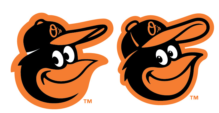
As you can see in the image above created by the MLB, the new cartoon logo stinks. The execution of the design is crude. It contains an awkward white shape, inconsistent weight on the line work, confusing detail such as the bottom of the beak, incorrect perspective most noticeable in the eyes etc. The artwork looks like a minor league designer pulled it off instead of a skilled seasoned veteran.
I’m no graphic design expert (or even novice, for that matter), so most of the above is simply gibberish to me.
Fortunately, Von doesn’t just critique the in-place design, he offers up his own.
Personally I think the MLB is in a design slump recently. One of the worst ocular offenses of late by the MLB is the Florida Marlins new logo. It’s like getting a 90 mph beanball to the eye socket.
So I decided to step up to the plate and take a swing at the Baltimore Orioles cartoon logo myself. And the above image shows how I would have created it using the same limited palette of colors.
The design created by the MLB obviously went through stages of approval and the fact it was released without being refined and appropriately improved upon only reinforces the fact that the MLB design batting average is hovering around .200 right now.
Here is Von’s “improved” Cartoon Bird:
So, like I said, I originally started reading the blog with a closed mind. However, I was quickly convinced that Mr. Glitschka was probably on to something.
His design DOES look a bit better, at least to my eye. A side-by-side comparison might help as well…
I definitely like the improvements to the bottom of the beak. However, to be fair, on the actual O’s embroidered cap, that part of the beak is raised enough to set it off sufficiently. Still, I find it hard to argue against the redesign.
I like adding the pupils, the line to the cap, and I definitely prefer getting rid of that weird “white triangle” below the cap on the back of the head…what’s up with that, anyway?
Mr. Glitschka wasn’t always right either though, as I really don’t like this other color scheme that he put forth:
Meh.
I would be remiss to not mention that Von claims that he spent his childhood as an Orioles fan, right up until the point that his (and my) favorite Oriole ignored his autograph request:
I’m familiar with this cartoon bird approach because in the 1980′s I was a hardcore Orioles fan. My favorite player was Eddie Murray and my favorite hat was the cartoon bird logo used at that time.
That all changed one summer when the Orioles came to Seattle to play the Mariners. I showed up early at the press gate, baseball cards and a sharpie in hand to get Eddie Murray’s autograph. His cab pulled up and Eddie Murray began to walk towards the gate, I intercepted him holding out my baseball card and saying “Mr. Murray can I please get your autography.” Murray kept walking, didn’t even look at me and said gruffly “Get outta here kid!”
From that point I didn’t like Eddie Murray any more, and found a new favorite team in the Boston RedSox.
While it’s disappointing that he abandoned the O’s, it looks like he hails from the Pacific Northwest anyway, so it’s not like he had any true ties to them.
Of course, it’s also really easy to write off the work of a bandwagon Red Sox fan, but if I’m honest with myself, like I said, I think his design does offer some improvement.
What do you think, Birds fans? As we see above, The Cartoon Bird is always evolving. Would you like to see some elements of this “improved” design incorporated in the next iteration?







7 Responses
I’m a huge O’s fan. So much so that I named my dog Brooks because you can’t get a ball past her either! I love the redesign. Von Glitschka did a fabulous job on this!
I like the real bird on the hat
Von is one of the nation’s leading design influencers, and a speaker at some of the most highly regarded design conferences. He has been published numerous times, including his own books…more than one at that. To say that his improvements are “a bit better” is a huge understatement. An experienced designer knows that the subtle differences make a huge impact on how the visual language conveys meaning. He’s certainly made a major improvement here, including the full-color version. Personal associations and subjective feedback aside, the design is stronger. I’d love to see more of this introduced to all of our favorite sports teams!
P.S. fantastic article. We need more like it! Maybe Von would do an illustration of our beloved Cal for us someday?
Von’s version isn’t an improvement at all. Refinement doesn’t always equal better. I think you need to consider the applications the logo is used for; cap being #1, but also TV scoreboard graphics and bunch of other stuff where it will be seen as very small. A cap logo needs to be bold and relatively simple, almost like a symbol on a flag. Unnecessary details, like the pupils in the eyes, would be totally lost in those applications.
The current cartoon bird logo is just fine as is. Whoever designed it did a great job of taking elements from the past logos to create something new while still being familiar, fitting in perfectly with the old.
Check out the banner of all ten of the past variations side by side from cartoonbird.mlblogs.com. You can see how the new logo really fits in perfectly with the others. The so called “improved” logo would totally stand out with those “enhanced” details. Plus, it just looks too cutesy. It reminds me of that Disney-like Orioles Fun Bird logo they used to use for anything to do with kids in their advertising.
I like his redesign so much I got it tattooed on my hand !
Now THIS is how it’s done:
http://cartoonbird.mlblogs.com/2014/02/02/baltimore-orioles-cartoon-bird-logo-perfected/